Clarift
- Logo Design
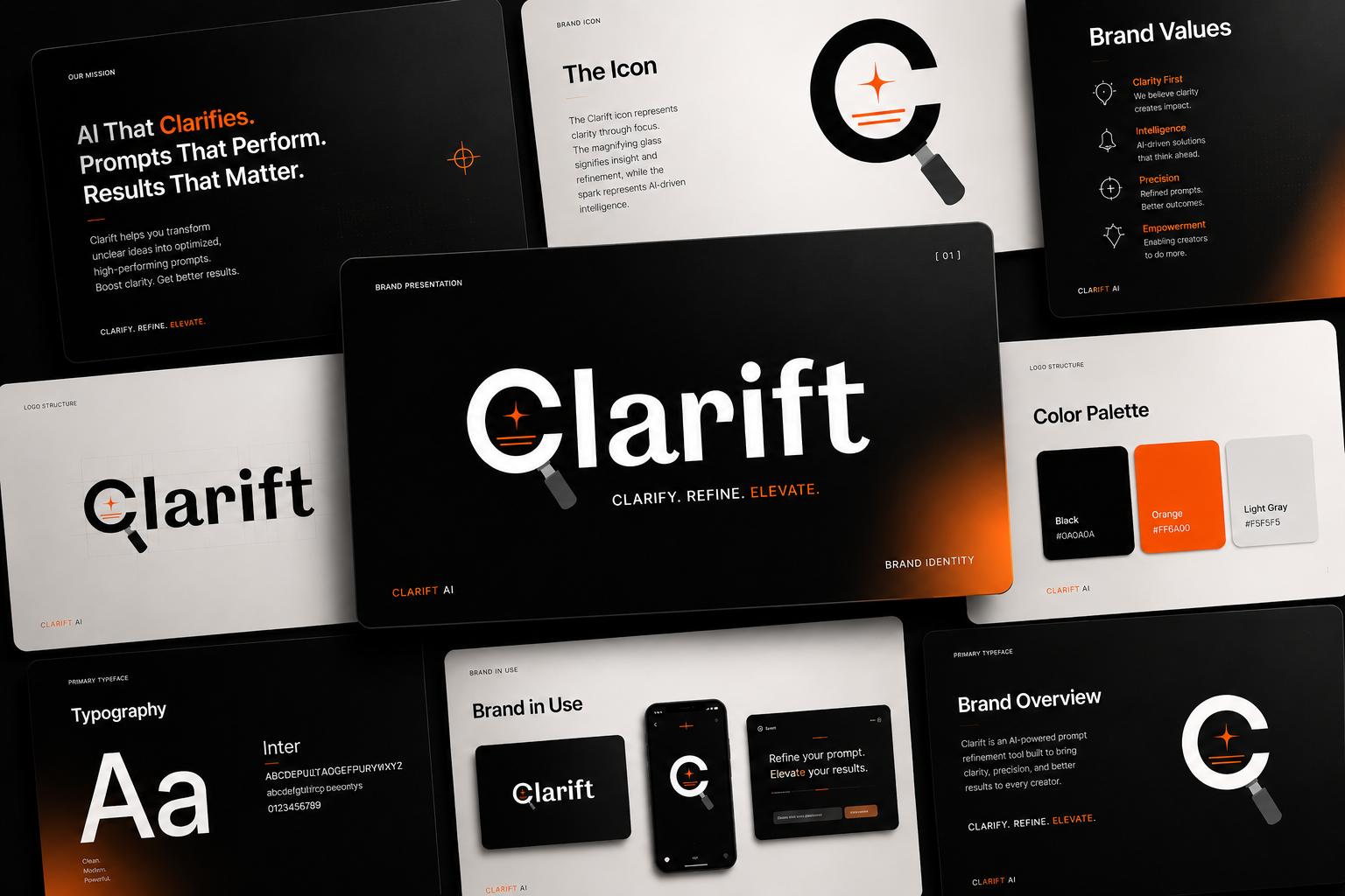
- Brand Identity System
- Colour Palette
- Typography Selection
- Icon Variants
What We Created
The Brief
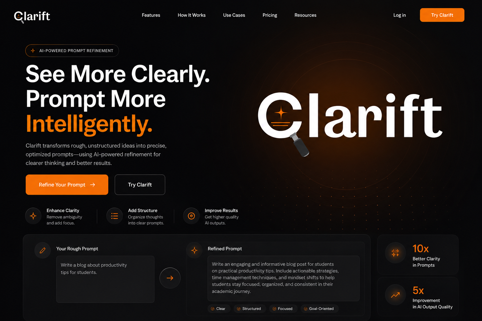
Clarift is an AI-powered Prompt Refinery tool built to transform raw prompts into clearer, smarter, and more effective outputs. The brand needed an identity that felt as precise and intelligent as the product itself - one that communicated clarity, refinement, and AI-driven enhancement at a single glance.
The goal was a mark that felt unmistakably modern and tech-forward without losing warmth - something that could live confidently on a product interface, a pitch deck, or a billboard.
Design Approach
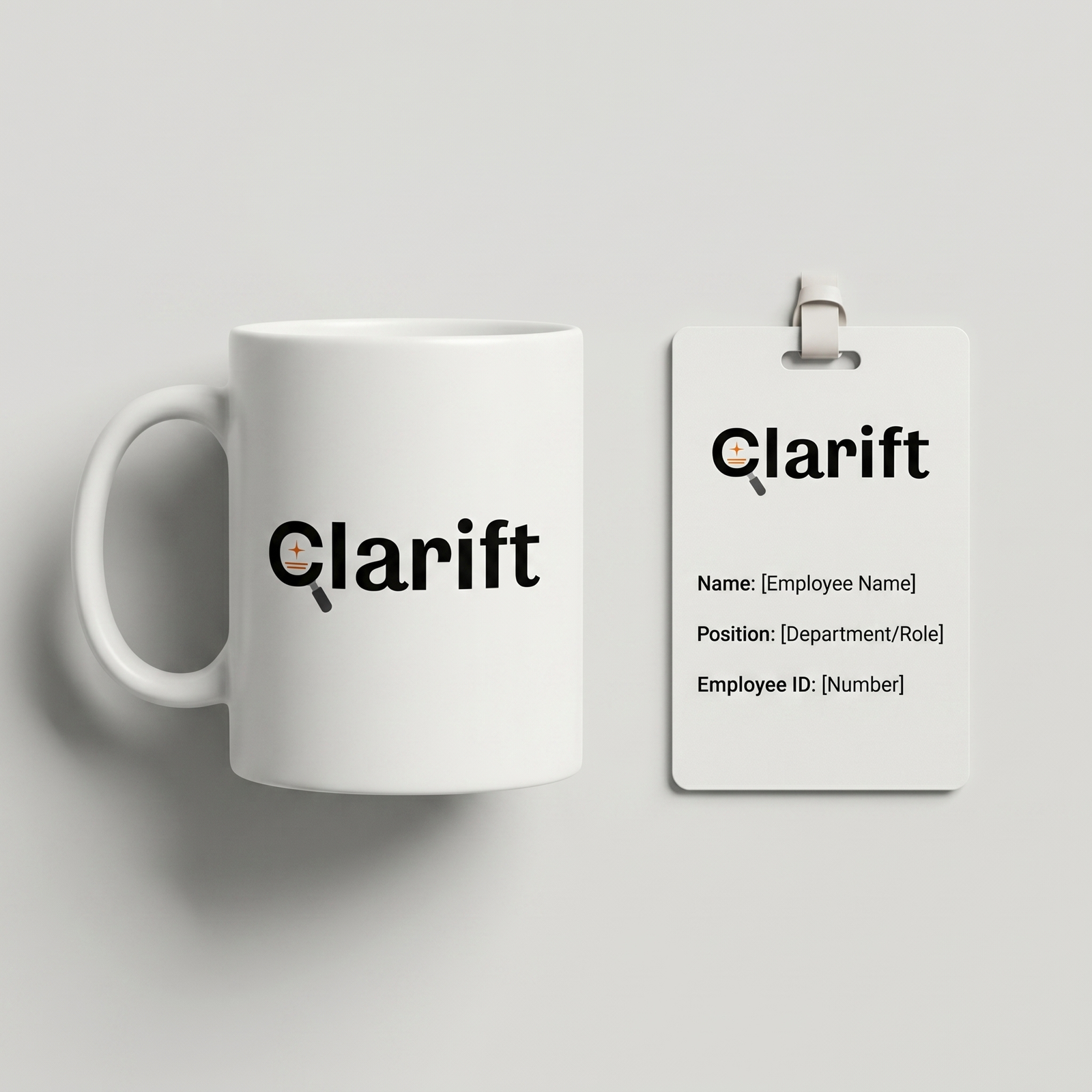
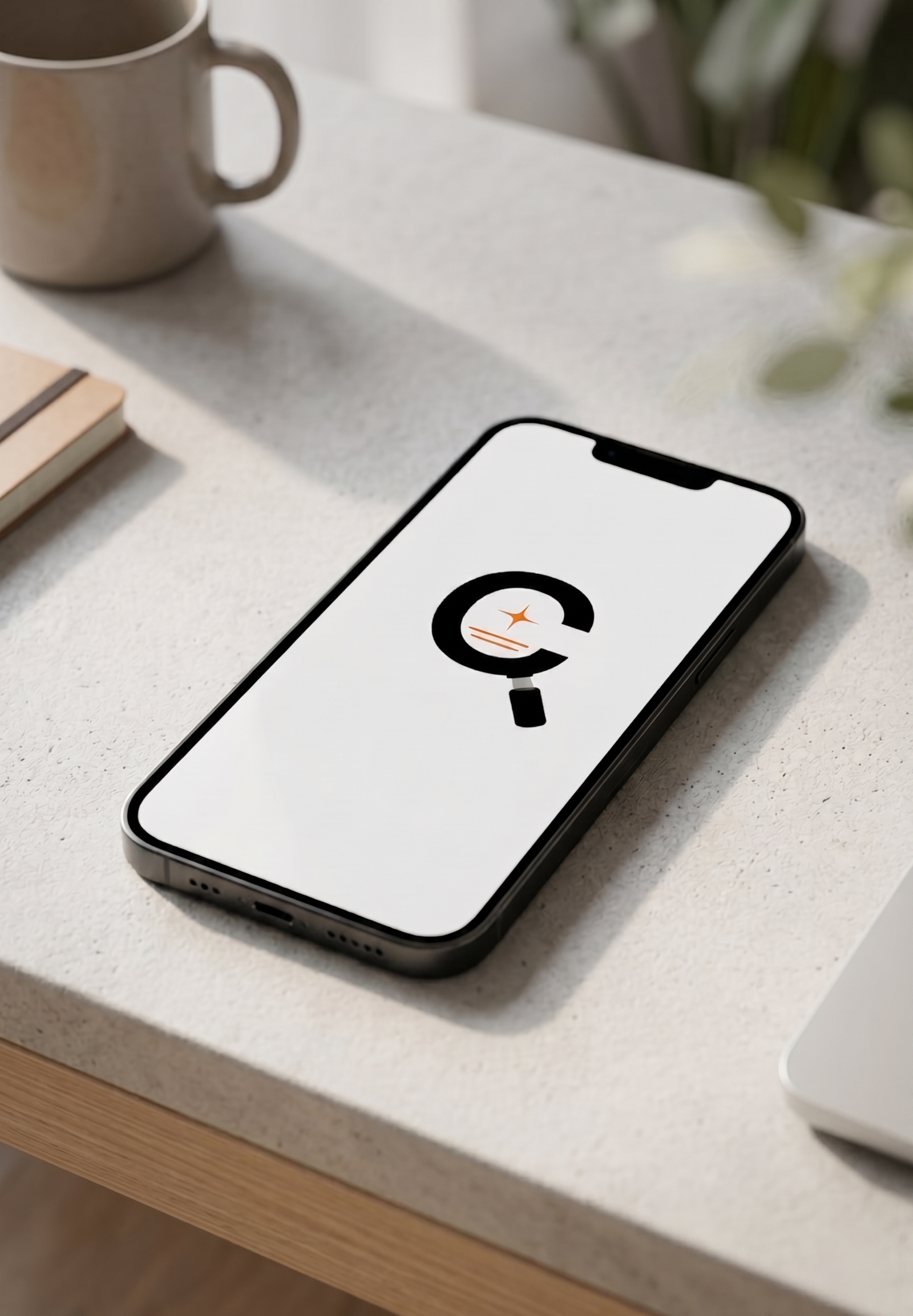
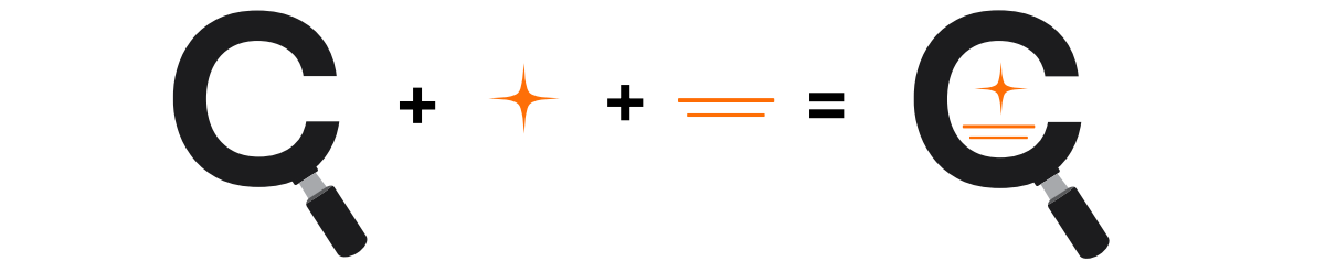
The icon is built from three elements fused into a single mark: a magnifying glass shaped as the letter "C" representing clarity and refinement, a four-pointed star communicating AI intelligence and enhancement, and horizontal text lines symbolising structured paragraphs and clear communication.
Together, these three elements combine into the signature Clarift icon - a symbol that visually expresses the product's core promise: transforming raw prompts into clearer, smarter, and more effective communication.
Brand Colours
Brand Typography
abcdefghijklmnopqrstuvwxyz
0123456789
abcdefghijklmnopqrstuvwxyz
0123456789
Logo Variations